This blog is a continuation. If you haven’t done so already, read Essential Elements of VR Learning Design (Part 1) for more context.
Must haves for excellent VR learning design
Environment where learners are comfortable
Providing an environment where people are comfortable is a must-have in VR learning design. Virtual reality is a very unique form of media in that you can easily make someone feel sick or uncomfortable during the experience. When immersed in VR, the environment and movement trigger the senses. If the experience is not built correctly, nausea or motion sickness can be a direct result.
“You have to make sure the entire experience isn’t glitchy and doesn’t lag so that it doesn’t result in motion sickness for the user.”
Ryan Chapman, CEO of Motive.io
The best way to ensure a smooth experience without lag or glitches is to have a 3D artist build your virtual reality environment. Poorly lit environments, out-of-scale items, and screen lag time are the things that make people feel motion sickness in VR. They pull the user out of the experience. It’s worth the investment to have a trained 3D artist build an environment that is properly lit, scaled, and runs well without frame rate issues.

Simple and intuitive experiences
A simple and intuitive experience is a must-have in VR learning design. As you design, keep it simple. Focus on movements and actions that map to the training objectives and mimic behaviours the user should perform in the real world. Include guidance for the user so that they intuitively know what they need to do in each interaction, and what they need to do next.
Every VR experience needs a method of onboarding – a way to explain the mechanics and give the user time to get acclimated to the virtual environment. The onboarding should also include details on the learning objectives and information on how to meet those objectives. Upfront onboarding allows the user to spend less time learning the system and more time learning the concepts and objectives that they are there to learn.
Consistent feedback for the user
Consistent feedback for the user is a must-have for VR learning design. As the user moves through the steps in the experience and interacts with objects and other people, they will require feedback. Feedback tells them they are doing it right or wrong and can explain the consequences for both.
Let’s consider an experience where the environment looks like a mine shaft. Inside, the user can walk around and see objects and people, but nothing reacts when the user touches it. The simulation feels broken because the user’s actions are not getting feedback.
Use feedback to bring the items to life and truly define what it means to interact with them. Feedback can materialize by picking up an item you touched, physically feeling the experience with haptics, or having another character speak to the user. Feedback also presents itself in sound. Ambient sound should be considered as well as what sounds the user might make as they move through the experience, like footsteps. The key is to define what feedback will be and to keep that feedback consistent.
Less important aspects of VR learning design
Photo realism of the environment and avatars
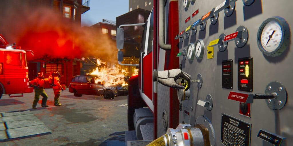
Photo-realistic environments are less important in VR learning design. It’s tempting to assume that every detail of a VR environment has to be exactly perfect for it to be effective, but we underestimate our ability to fill in the information gaps.
A human brain is an association machine. We are very good at adding context where it otherwise might be missing. Our brains take what we see, hear, and feel and link those to emotions and memories, weaving in the context where it is otherwise lacking.
Let’s consider the VR experience in a hospital room. The user virtually enters the hospital room, and their mind begins to immediately fill in the blanks. The user has a frame of reference from previous experiences and immediately begins to make associations between any characters or other elements and the environment.
The vials of medication in the room are not exact replicas but are similar enough that the user’s brain will assume they are vials of medication. Users are not at all concerned that every vial isn’t exactly right; in fact, they completely bypass the differences because they are in an environment they recognize and the movements and actions are the same as if they were in an actual hospital room. Creating a super realistic environment or other elements might be aesthetically pleasing, but it will not enhance the outcome.
Let’s imagine you decided to build a birdhouse for your backyard. There are a set of steps and specific elements that you must-have for the birdhouse to function properly, but painting the birdhouse a certain colour is not one of those must-haves. The colour of the birdhouse is less important when designing for function. Instead of building the fanciest and best-decorated birdhouse, aim for building the best functioning birdhouse. Instead of building the most photo-realistic virtual environment and elements, aim for the threshold of real-enough.
These same concepts apply to VR experience characters or avatars. VR designers often get caught up in making the avatar look as close to a real person as possible. Keep in mind that even in Hollywood movies, digital characters and avatars have teams of people working to create them, and sometimes a year or more to do it – and they still don’t look quite right. Our brain can fill in those gaps.
Avatars and characters are meant to elicit an emotional response from the user – through associations in the mind. They create a connection with us. People have connections to animations that do not look like us at all. Think of your favourite animated character. Chances are it is not even a human animated character – maybe it’s a dog or cat or even a martian. Much like we connect with animated characters in Hollywood movies, we make the same associations in VR.
Learn about additional must-haves and less important areas of VR learning design in our previous blog post.
Would you like to know more about VR Learning Design?
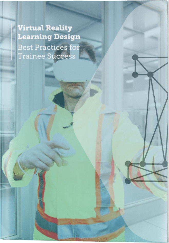
Download our free guide on VR Learning Design Best Practices.

Latest Posts
Stay in the Know
Want to stay up-to-date with what is going on in the world of immersive training? Subscribe to the Motive Blog.
Ready to revolutionize your training program?
We’re ready to show you how seamlessly you can create, edit and deploy VR training modules. Our team is standing by to help you revolutionize your training program.


